That's because I'm kind of a dull boy and I can never understand them as well as I should at first glance - in other words - I have to interpret what they are trying to tell me before I understand what they are trying to tell me and in the end I'm no more informed than at the beginning. Because - truthfully - the fact that DIA:IWM is currently 1.66+ is absolutely meaningless to me regarding either DIA or IWM.
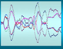
That's why I invented Marlyn's Curve. The curve represents the same concept except in more quickly understood gaudy colors.

This is the exact same 200 days and I can easily see that, first, the large cap as indicated by DIA is running away from the small cap as indicated by IWM, and second that the DIA is rolling over - which is something you don't catch on the abc:xyz charts.
Now comes performance charts and while not exactly the same as Marlyn's Curve (not as smoothed) they tell basically the same story for less work

John Murphy (stockcharts founder and guru) has hit another home run. Of course this doesn't measure the momentum (which is why I smooth the Curve) so you don't get that but if you want a quick, smart, and low work comparison - performance charts is the place to go.

2 comments:
Theirs a lot of data out their.
d1x27g1e24 j7b31q0u78 e3s86z9d54 p6d09r7j44 e7c14v5p52 a8k72o3n06
Post a Comment