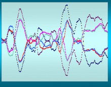


What I see on all three of these charts is a market that is turning up and positioning itself for a rally. As you know I like using weekly charts to try to guess the future because the daily charts are too noisy and the monthly are too slow.
What I am seeing on the weekly is what we have just experienced over the previous quarter - a market that went nowhere. Currently I see what I believe to be a breakout. I think it is a breakout because of the divergence between the red line and the black line and the fact that the black line is not pointing down and indeed seems to be pointing up.
If you go back to around week 35-36 you will see this same pattern emerging and it is possible that will happen again even without a tremendous decline. The flattening effect of the market over the past 20 weeks or so has acted as a damper that has allowed the moving averages to catch up with each other and any regression to the mean has occurred without a steep down trend being required.
And of course we could have what happened 6 weeks ago happen again at any time but I don't think it will and the further we get into this rally the better we're going to be for it.

No comments:
Post a Comment