As you can see in the figure(using the powerful comparator - the proprietary Marlyn's Curve) while the Dow returns are collapsing the small caps as represented by the IWM are actually rising.
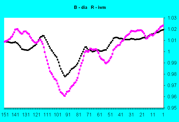
In the last 20 days during the time of the vaunted Dow 30 record-making run the small caps have been going up while the Dow 30 has been rolling over as a prelude to going down.
For those of you coming late to the party - I use returns as a basis of comparison - not absolute value. Absolute value is useless because you can only spend returns and stay healthy. (If you eat your seed you die).
Update - 10 26 2006 - I didn't like the looks of the diagram and it turned out that I used the wrong one. This one is correct and shows the correct relationship between the DIA and the IWM.

No comments:
Post a Comment