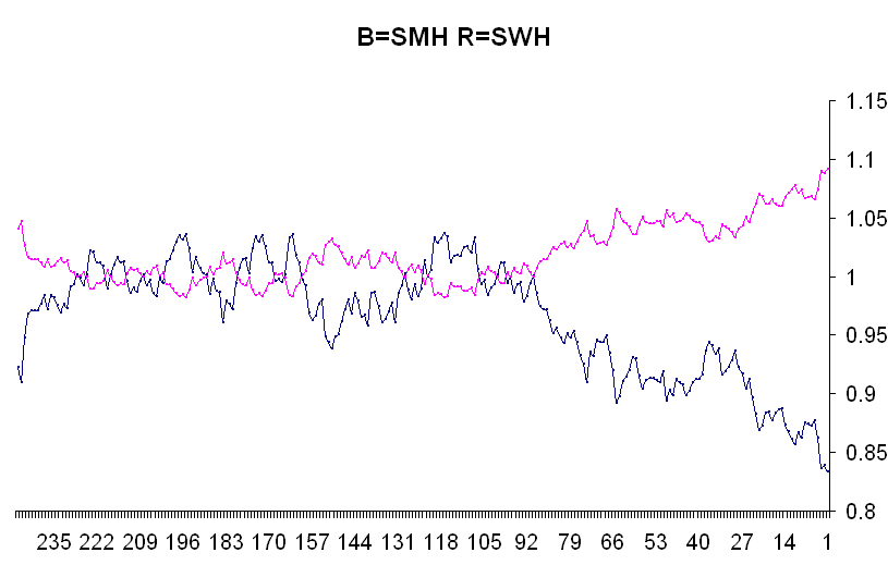
What I did was download the historical daily closes for the two ETFs, add them together, divide by 2, then divide each one by the result of the third step and plot the final product and what you see is the SWH running way above the SMH. You also see that in the past these two have stayed pretty close to one another. This diversion began about 100 trading days ago or earlier in the summer or about the time of the last earnings reports.
The idea now is that the black line will close up towards the red line and vice versa. Now needless to say but say it I will - that doesn't have to happen - in other words software can continue for a long time above hardware and in fact never come back to meet with it - this probably won't happen but it is possible.
All I wanted to do was show you a different way of looking at the situation since I've never been able to understand those xyz:abc charts. And this, I think, shows the situation in a much better light.
No comments:
Post a Comment