Showing posts with label Marlyn's Curve. Show all posts

Saturday, May 12, 2007

Short QID or Long QLD?

A reader wrote (a long time ago) asking my opinion regarding whether it was better to short QID rather than go long QLD.

I've done some thinking about this and a couple of studies and we will get to the math in a minute. The most exciting news is that Proshares seems to have worked out their problems with these two ETF's and they have established the mirror image that they are supposed to have.


Even the most casual observer will see that these two funds were skewed early in their history but now they are achieving that most wonderful moment of all - symmetry. Of course that's because of the averaging that we go through in Marlyn's Curve. We would expect to see symmetry if the funds were supposed to be symmetrical.

But are the results of each fund symmetrical as well? Over 178 days during which there were 102 days when you could have bought QLD or sold QID the average returns were 1.01248% (QLD) vs 1.01286% (QID). Which is not much variance on a share by share basis - but over thousands of shares and hundreds of transactions it could add up to a significant amount of money.

But sometimes percentages are not all they are cracked up to be. Sometimes you need to go into the numbers to get the real story. And that is what I did - Instead of looking at raw percentages I looked at the dollar rate of return for each transaction. And then I summed that value and took an average across all of the transactions. Needless to say on that basis QLD came out the best ($1.02 to .70) but ... and there's always a "but" ... I failed to normalize the prices one to another - in other words I needed to make them equivalent money-wise. Once I did that here is what I found.

In the first half of the 178 day period the return was $1.201 per basis for QID vs.
$1.125 per basis for QLD. Over the entire period the return per basis for QID was 1.078 vs. 1.026 for QLD.

On Friday for example had you shorted 1.95 shares for every one share you could have purchased of QLD you would have made $2.38 vs $2.14 per transactional basis. But (another "but") that's an awful lot of math for a simple stock transaction so lets look at it another way.

Had you just shorted 1000 shares of QID you would have made $1220 and had you bought a 1000 shares of QLD you would have made $2140. But you would have had to have put up over 90 thousand dollars in the QLD transaction and a minuscule percentage of that in the QID transaction.

So my thinking is this. On days when you can be pretty sure that the market is going up (and Friday would have been a good one) shorting the QID model seems to be the better idea if you can get the shares - and that might be the only difficulty with this whole idea.

Of course if you want a technical reason to buy or short either of the products you would put up a four-minute chart of either or both of them with an EMA 90 and wait for the cross.

Here is QID on Friday -


And here is QLD -


You can see how once the stocks crossed the EMA 90 the die was cast and it was an easy trade to make either way.

Wednesday, February 21, 2007

What Are The Cyclicals Telling Us?

I read an article via Seeking Alpha by Eddy Elfenbein that Cyclical Stocks are Soaring and Eddy suggests that this means that the economy is doing great. The fact that I just read this same idea by Cramer suggests to me that Cramer is writing under a different name - or we have finally found out what Cramer's name in the States was. (Back in the ancient times - when Marlyn was but a child there were only a handful of States and when people went out into the territories to search for gold and other treasure they often changed their names - and not to protect the innocent - if you get my drift).

Anyway. Eddy says: I like to track the CYC/S&P ratio, which often gives us a better reading on the economy’s health than any government report. The ratio increases when cyclicals outperform, and decreases when cyclicals underperform. Eddy has a couple of other things to say about this and it is probably worth the read.

So I pulled up a picture of the ratio done from the basis of Marlyn's Curve and guess what I see - we are reaching a turning place. Eddy sees that too - Cramer doesn't - so maybe they aren't the same guy or maybe this is just standard Cramer calling an up in one venue and a down in another. I don't know, I don't care - but if you look at the chart you will see volatility decreasing and that the turn point is very near.


This chart is on a weekly basis and shows the last 8 years or so of the ratio. That puts it back into boom time, through the last recession of 2001 - 2003 (boxed in on the chart) and into the current times.

Now here is Marlyn's curve - this chart shows how these two indices play together - but the one thing you can't help but notice is that the SPX turns first - both down and up. Very seldom do the "cyclicals" lead. The second thing I noticed was the same thing I noticed on the other chart and indicated with the arrows and lines - volatility is disappearing even in the cyclicals. This chart is the same basis as the last.


The last thing I want you to make note of - the SPX is rolling over. Now that doesn't mean that it has to go down very far and in fact it doesn't anymore but it is going to take a rest in the near future so be prepared for it when it comes.

Monday, February 19, 2007

Small Caps Rising

My new rendition of Marlyn's Curve shows exactly what the old one shows - small caps as represented by the IWM ETF are once more taking the lead. The tired old Dow Industrials on the other hand, despite making new all-time record highs day after day after day, are kind of flat - in other words, for as strong as they appear to be in the newspaper or on TV they are actually pretty not doing well at all.


As you can see the small caps took a hard turn back about January 24th or so. Again Marlyn's amazing Curve doesn't concern itself with the mundane of price but rather the excitement of return so we can see that you would have been better off putting your money in IWM rather than DIA.

The Q's have turned down again which reflects the problems that tech is having finding a champion now that GOOG and MSFT and AAPL have all abandoned ship. SPY is looping up a bit and the dodgy old Dow just stays flat to down. Was there ever a time to play long caps in the past year of so - maybe back last Spring when the small caps turned over and the Dow took a bit of a jog up. But since that brief time - no - unless you want to call being in big caps during the run down into August was a good thing (you were losing less on a percentage basis at that time). And then there was another brief period - but you get the point.

Small caps rule.

Saturday, November 18, 2006

Marlyn's Curve - Revisited

We've used the Marlyn's curve on the site to demonstrate a number of points - some I'm sure you've agreed with and others - well are you going to believe your lying eyes or not? But I want to emphasize that Marlyn's curve is used in the most part for information, to inform, and not as a trading device unless you know what you are doing. Even then it is only a sentiment indicator no better nor worse than any other - the only difference being by using Marlyn's curve I can compare two disparate stocks and make decisions regarding one or the other of them just based on the comparison. You've seen this a number of times on the site. For example I've shown you how the RYDEX funds compete with one another and how oil and airlines work together (or against one another) and in a recent post - how the Dow theory might not be all that it is cracked up to be. Today I'd like to discuss the curve as a trading tool and explain the components.


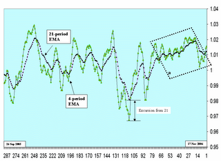
For comparisons any simple moving average will work and I usually use the 20-period moving average of the 20-period normalized returns for that purpose. But for trading I like to kick it up a notch (as somebody famous usually says - love that spaghetti sauce by the way) and use the EMA's of the 20-period normalized returns. Someday when I have the time I'm going to test a method where I normalize the returns using and EMA but for now it is a simple method. Anyway looking at the picture what we see is that part I showed recently (in the dotted box) that shows why we day traders have been having such a hard time this summer and fall.

Recently we had a nice downturn for a bit and now it appears that the INDU is turning back up again. I use two averages in conjunction like this so I can understand what is happening in the near and intermediate term simultaneously.

The 21-period EMA is used to determine overall market sentiment. I.E. what is the trading community at large feeling about the market as a whole. I generally wait for three days to decide whether the market is turning up or down after a major turn. This is why the last 80 days or so have been so difficult - every 3 days the sentiment changed. It whipped back and forth in a directionless manner for weeks and weeks even though it was generally going up. I think this was a result of the transportation average being off so far. Traders who believe in the Dow theory were trying to beat the market down but the dynamic of the market in a totally hedged environment is up up up. I'm talking in global generalities now because when you talk about something as large as the market you really only can generalize.

But again the evidence in box a is overwhelming in its message. We have just gone through an extremely unusual period in the market and - are you ready for this - nobody noticed. At least nobody who makes a living with a blog or on TV. But even if they had noticed the story is so difficult to tell with their primitive tools they simply couldn't tell it. Even I can't really tell it because it is all after the fact. I can only point backward and say see - that's what happened.

I use the 4-period EMA to inform my trading. I watch it as it runs away from the 21-period and when it gets to a certain point it generally turns. This "certain point" is not some hard and fast value - I just start getting ready as the difference grows.

I use this also in my daily trading where I watch the excursion of the EMA-4 away from the EMA-21 and if certain candles start forming when that difference seems excessive - I close the trade.

The other thing that happens when the market direction changes is the momentum starts slowing. Note that you can see this in the major curve by the fact that the ticks get closer together. Then when the market is running the ticks get further appart. See how in the directionless period the ticks never separated by much at all. Again this is a feel or a sensation not a hard fast measurement. I suppose I could average it but then it becomes institutionalized as a metric and most metrics are absolute crap. This would be one of those.

The other interesting thing is that the major curve pretty much stays between .98 and 1.02 or a 2% maximum excursion from 0. But that's another useless metric that you needn't put any stock into.

The only value of Marlyn's curve other than being able to compare issues is to show the sentiment of the market as a whole and to kinda sorta halfassed predict turns - and that's it. But isn't that the story of most TA?

Wednesday, November 15, 2006

When Last Seen

Here is an update for IWM and the three sisters - last seen 3 days ago. Note the changes = the Q's have actually rolled over and crossed IWM. Meanwhile SPX is attempting to do the same to DIA. Most important however is that the distance between ticks is growing smaller. This indicates that momentum is on its way out of the market and when momentum goes the direction changes. Consequently I would think that we are now going to go into the Santa Claus rally that we seem to enjoy every year.

Wednesday, November 01, 2006

Wednesday Morning Going Down

The futures are all pointing to a happy day but given the fact that the revenue prediction from BIDU was weak I think the market is going to collapse - isn't that silly - one stock projects a weak revenue stream (in China no less) and the entire U.S. stock market collapses. What a bunch of BS. Sounds like some of the crap that comes out of Washington in the name of policy doesn't it?

Prices go up and down as a result of supply and demand. If there is no supply but a great demand price will go up and vice versa. Momentum is affected by the amount of demand not by the price - if something was once very expensive - e.g. buggy whips - and they are now a dime a dozen - e.g. buggy whips - but no one wants one - e.g. buggy whips - it doesn't matter how much they cost - does it?

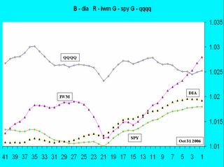
The fact of the matter is that the large cap stocks are mostly overpriced and the momentum is coming out of that market while the small caps and the tech stocks are being chased. The proof is in the following diagram where I clearly show, using Marlyn's curve, that the DIA and SPY are both turning down, the Q's are button hooking up and the IWM continues the rise begun some 20 days ago.


Remember Marlyn's curve acts on returns which are spendable not price which is not.

Wednesday, October 25, 2006

Small Cap Large Cap

The beat goes on but the good news is that despite a continued march towards ever greater closes the DOW is actually breaking down. In case you were wondering why you can't beat this dumb market it is simple - the returns just ain't there Magee - they just ain't there.

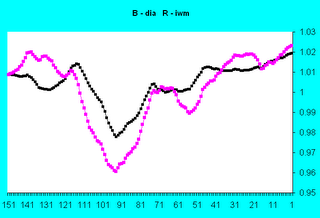
As you can see in the figure(using the powerful comparator - the proprietary Marlyn's Curve) while the Dow returns are collapsing the small caps as represented by the IWM are actually rising.


In the last 20 days during the time of the vaunted Dow 30 record-making run the small caps have been going up while the Dow 30 has been rolling over as a prelude to going down.

For those of you coming late to the party - I use returns as a basis of comparison - not absolute value. Absolute value is useless because you can only spend returns and stay healthy. (If you eat your seed you die).

Update - 10 26 2006 - I didn't like the looks of the diagram and it turned out that I used the wrong one. This one is correct and shows the correct relationship between the DIA and the IWM.