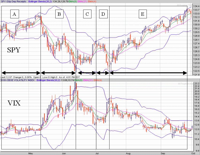
The figure shows how the VIX and the SPY interact across relative to their own volatility. And how the SPY reacts relative to the VIX. In this 6-month period (through yesterday 2 October 2006) I’ve outlined 5 regions of change. In the “A” region we see a period similar to now (“E” region). The SPY is flying high and the VIX is running low. The volatility bands are narrow for both articles. In the “B” region volatility begins to expand and the VIX rises as the SPY falls. Note that the VIX did not cause the change but the violent downward price action of the SPY caused the bands to expand. Note how towards the end of the “B” region the volatility bands for both the VIX and the SPY begin to contract once more indicating a dampening of volatility for both indices. There is a mild transition through “C” and “D” leading into the “E” region.
While bands can stay contracted for awhile the fact is low volatility as is seen here must give way to higher volatility or the market will end. Volatility is the pulse of the market without it there is no market. Consequently I think we are in for a period (weeks not months of volatility expansion) before this market can go much higher.
No comments:
Post a Comment