Which is leading? Is there a rotation to large cap? What a stupid thing to discuss yet crapvision spends a lot of what otherwise could be productive dead-air time discussing it. And they bring in a lot of high priced airheads to add to the discussion. Of course at the end of the story all they add is general confusion – which is what they are supposed to do. Confusion generates commissions and Wall Street lives on commissions. That and selling high to you what they bought low from you last week.
Well old Marlyn to the rescue folks – no need to worry – no need for dismay – what you are about to see is that one’s about as good as another – in the long run.
Here, using my proprietary method for comparing apples to oranges, are two charts. The longer one is the last 290 weeks of the DIA (black line) overlaid on the IWM (red line). The short one is for the past year.
For those of you who are still in the first stages of your investing education the DIA is an exchange traded fund (ETF) that represents the Dow Industrials and the IWM is an ETF that represents the Russell 2000, or small cap index. What you are looking at is what I call “Marlyn’s Curve”.
Notice that there was a bear market dip back in Nov 2001 in which both indices participated about equally. But the large caps, as represented by the DIA, led the way out. Notice that the huge, end-of-the-last-bear market in 2002 was led by the DIA (around week 232 or so) and that the IWM quickly followed. Also notice that while the DIA doesn’t achieve the lofty heights of the IWM it also doesn’t plumb the depths with its little brother either.
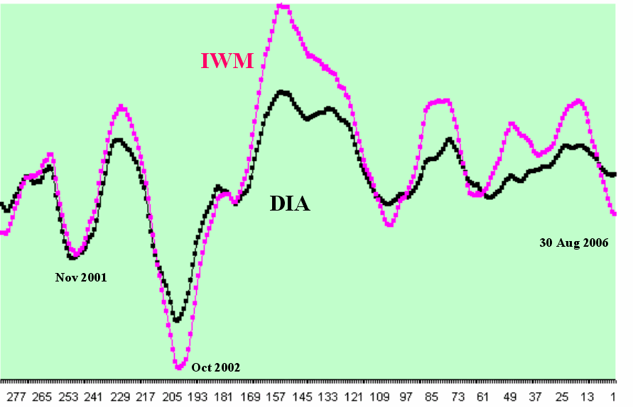
Most importantly in almost every instance the DIA leads both down and up. It occurs to me just looking at this that I’d rather be in large caps on a decline and small caps on a rise – but that’s just me. I have a low tolerance for losses.
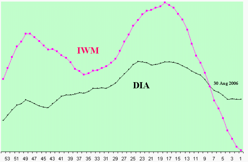
The second chart is just a blow up of the last 54 weeks of the chart above. Notice how the high flying small caps have been going great guns until about 23 weeks ago when the large caps suddenly started developing some problems. Notice how the small caps began their plunge and how quickly they descended. About 8 weeks ago they passed the large caps on the way down and, guess what, you better have rotated into large caps at that time or you’re in big trouble – aren’t you.
I’ll let you know when you should go back into small cap. Or maybe you can just watch crapvision I'm sure they know what they're talking about.

No comments:
Post a Comment