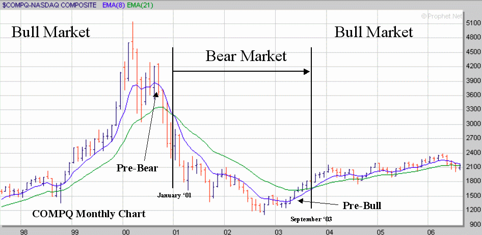
Let’s start with the COMPQ or the NASDAQ chart. Everyone says that in order to have a Bull market tech must lead. That’s just more bull snot. We’ve been in a bull market for almost three years and guess what – small caps led (see RUT chart later) – tech just lollygagged along bringing up the rear. Here is how you know that you are in a full blown Bear market. First you stop looking at daily charts or even weekly charts – for global market direction you need the monthly charts. Second put away your Fibonacci arcs or your Elliot Waves or any other juju you want to use and get a real indicator such as an 8 EMA overlaid on a 21 EMA. Then observe the 8 EMA in relationship to the 21 EMA. See how it flattened out through ‘00 and then rolled over and began converging on the 21 – that’s what I call a pre-Bear market indicator. But the most important thing to notice is that the 8 EMA is some distance away from the 21 EMA (regression to mean guys love this concept) and then it (the EMA 8) flattens and then it converges on the 21. Notice that there is a huge amount of volatility in the bars that are shown in the pre-Bear phase. Then when the 8 EMA finally drops below the 21 EMA we are in a full fledged Bear market. Notice what happens 18 months later. The volatility totally dries up and the 8 EMA turns back up towards the 21 EMA. This is the signal for a pre-Bull market. Six months later the 8 EMA crosses the 21 and off we go again. In this aspect volatility is the excursion from high to low on a monthly basis. Note carefully that I don’t have one bit of volume shown on the charts. That’s because volume might be an indicator of immediate concern (i.e. last 5 minutes or so) but on a large-scale basis it is bogus. If you don’t believe me that’s fine - I’ll do a volume post later this weekend to show you what I’m talking about. If after that you still don’t believe me – well that’s your problem, not mine.
The INDU presents a similar pattern just begins to flatten a lot earlier and rolls over and crosses a lot later. Then when the volatility begins to dry up it finally turns north again (about the same time as the COMPQ) and rolls over up on its way back into Bull territory.

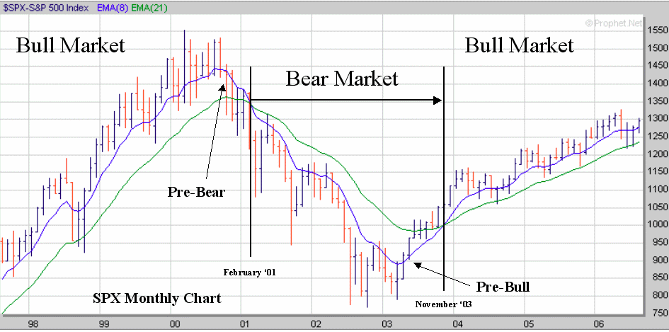
But regardless of the COMPQ and the INDU the real index to watch for a Bull or Bear market is the SPX. Why? Simple – it includes the INDU and the important parts of the COMPQ and is 30% financial and without financial you don’t have a “market”. Notice again the same pattern as seen before – an increase in volatility, a flattening, a roll over, a cross below, a drop, a decrease in volatility, a roll over up and finally a crossing going up. February 2001 to November 2003.
The next chart is the RUT or small cap index. You can discern the same pattern again – an EMA 8 running away from the EMA 21 with increasing volatility – roll over and drop till finally the volatility runs dry and there is another roll over and up it goes. Note carefully that it led us out of the last Bear market – not the tech. In fact tech has gone nowhere in years. Notice the period in ’98-99 where we had a pre-bear – not! No volatility increase is noted. That was a consolidation, nothing more. You see the same effect on all four charts but only the RUT EMA 8 actually touched the EMA 21. What the RUT chart shows you is even if you have a Bear market in the majors you can always find a Bull in the juniors.

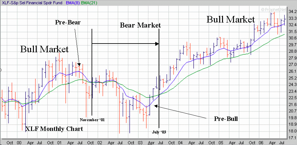
Speaking of financials here is the XLF chart. I’ve annotated it but I’m fairly sure that you can see the Bear and Bull market aspects clearly by now. Note that the current period doesn’t seem to be showing any Bear tracks.
Finally I give you the Wilshire 5000. I’m thinking that this index will become the defacto market indicator of the future. It was released just before the last Bear market began which was convenient for this post. The most import fact regarding the 5000 (not just the annotated Bull and Bear aspects) are the four areas I’ve circled and annotated as “summertime”. June, July, August, and September are obviously the flat months over the past 4 years. Interestingly enough it is always in these months that the Bear talk reaches its annual crescendo.

So – with all of those pictures annotated as they are - can anyone see the same pattern appearing currently in any of the three major indices shown? No – very good. How about in the RUT or the XLF or the Wilshire 5000? Still no – excellent. Now why would that be? Everyone who guessed: ‘because we are not in a bear market’; can stay after school and clean the erasers. The rest of you and you know who you are, can hang your heads in shame and stop frightening your classmates.
All of the base charts come from Prophet.net – an excellent site. I've added the annotation after the fact. As I’ve said before I have an account with them but they don’t know who I am relative to this site – so if you go there don’t bother mentioning me as I get nothing out of it except the knowledge that you are in a great site run by excellent people.
No comments:
Post a Comment