Showing posts with label volatility. Show all posts

Thursday, May 17, 2007

ATR Testing

We've covered some of this before but I like to revisit favorite themes every now and again to ensure that new readers have a chance to understand what we do here.

Today I'll discuss the advantage of using the average true range which I use as a 10-period averaged value or, ATR(10). I have reasons for using the 10-period - first it is the one most commonly defaulted on the various software packages I access but second - I've tested other lengths and the 10 always comes up the winner.

When I'm day trading from the minute charts and I have a couple of different selections I always like to use the one(s) with the highest ATR(10). However, when swing trading and trying to select between stocks I like to go with the lowest ATR(10).

The ATR is an excellent proxy for volatility and if you are looking for a quick 50 cent jump you want high volatility. On the other hand if you want a sustained rise over several days you want to start from a low volatility position.

This can be proven and I wrote a simple test to do so. I tested the 4 day to 30 day returns of stocks trading between 15 and 35 dollars with a moderate 90-day average volume of 500000 shares for each of the two following conditions -

ATR(10) reached a new 26-week high = 49% win percentage, .63 Reward/Risk, and -62% ROI;
ATR(10) reached a new 26-week low = 62% win percentage, 1.52 R/R, and 49.74% ROI.


While the low model achieved a much better return than the high model it really isn't anything to cheer about.

But I did capture this low method in the previous filter post - A New Way to Look at RSI(2) and ATR(10). And while I'm not using a 26-week low I am using a low reading that is unbounded.

Wednesday, April 25, 2007

Volatility Is King

Long time readers know that I hold the average true range as the key to volatility. Any other so-called volatility such as the VIX, VXN, or VXO are pretenders in my humble opinion.

Long time readers also know that whenever I make a bold statement I try to back it up with evidence - here is the evidence -


You can see where the ATR was during the "bubble" of the 90's. It began below 600 (monthly charts please) and then slowly climbed to over 900. 900 seemed to be the catalyst for the fall because once it broke 900 there was too much volatility and not enough liquidity to sustain the price and the market fell.

We've seen this picture on this BLog before - most notably on the daily basis since the 27th of February. You can see that the ATR did not break until the market bottomed - at that point it began to fall in a significant manner and the market resumed its climb. Notice too that well before the market completed its fall that volume was cut almost in half.

Now a lot of people are going to be saying all kinds of doom and gloom crap about Dow at 13000. All you need to remember is that the only number that matters is the ATR at 505.

And I know that there are hundreds of people, maybe even thousands who would disagree with my every statement - but none of them can produce a picture like I can.

But always keep Rule 1 firmly in mind - nobody knows nothing - including me.

Sunday, March 04, 2007

RSI ATR - A Practical Example

Revisiting that filter I spoke about yesterday here is a good example of what I was talking about. This is IMCL and you can see quite clearly that there were two occasions in the last month and a half when you could have taken this stock off the RSI/ATR set-up.


And at least one occasion when you shouldn't have. You can see on that occasion what I was talking about yesterday when I said that you had to wait for both conditions to be met to be able to say that the stock is bottoming with about a 65% assurance. If you had just taken this stock from the RSI(2) < 2 flag you would have been two days early.

Note that on both of the true flags the stock went on to post a blow-off bottom and that is just one more indicator to watch for - it isn't required but it makes for a good confirmation.

And confirmation is the most important thing of all - on this chart to the left you can see one more spot where the criteria were met but the stock didn't turn. Remember this business is all about confirmation and without confirmation we don't do anything foolish. No confirmation - no trade. It did finally confirm but didn't follow through - that's why you use a stop loss. On the next flag it followed through and then some.

In a previous post this morning the one about the past being prologue I said we needed to wait for the ATR to turn around and come down before we could be sure that the index had bottomed. This is not inconsistent with how I use the ATR as a proxy for volatility. In the ATR/RSI filter I am using it to look for low volatility because low volatility begets high volatility and if the stock is at the bottom then it should go up when volatility goes up. But both tops and bottoms are marked by volatility changes. If it is high it will go low if it is low it will go high.

For those of you not in possession of a capability such as being able to draw a moving average of the ATR note here's a tip. Just look and see where the ATR is in relation to its recent past and price bottoms. If it is anywhere near where it was the last time the stock turned and went up then it is probably at a bottom.

And finally - this chart is a screen print of stockfetcher.com's new charting interface, SF2 and it is a beauty. It is still in Beta but when they get it finished it will be a joy to behold.

I don't get anything from them for the endorsement so it doesn't bother me if you don't want to improve your trading ability.

Monday, December 04, 2006

Why Can't I Make Money In This Market

Well not me - actually you - I've cut back on my trading because of some things I don't like about the dynamics of the market and the time of year. But the last 4 or 5 months have seen some record gains in at least one index and for the rest of us some mediocre, at best, profits. My reader (thanks Mom) wants to know why.

The best excuse I can come up with is that we are dumbass day traders and had we simply invested (yes, Virginia, I said "invested") our fund (only rich people have "funds" most of the rest of us just have "fund") in the Q's back on July 26th we would have seen this happen.


And we would be living happily ever after. (Note how I cleverly pointed out a blow-off bottom way back then - yes, you even get them on the daily charts). We would have went from 36 and change to 44 and change and could have had a huge party.

Instead we tried to pick at the market and find places where we could make a quick buck and what we were fighting against was this -


Or chop-chop-chop for most of the time since the run-up began. Chop does two things to you - first it destroys your confidence and second it destroys your trading account.

I read this chart this way - for about the first 20 days of the run it was a long's delight because the market continued up unabated. This period, of course, was the rebound from the previous declining period - a rebound is generally robust. Then we went through about 50 days or so of chop. This was followed by a second period of smooth running and then a relatively easy time for the shortists over the past week or so.

The biggest problem with chop is that volatility disappears. It doesn't just get low it becomes non-existant. If you get the same volatility reading within a couple of cents every day for weeks on end that means that there is no volatility. I.E. nothing is moving. But actually what it means is that while some things are zigging - enough other things are zagging so that volatility remains benign. I attribute this to the 8500+ funds that currently prowl the market using automated technology looking for every sign of weakness both long and short.

Here is what volatility looks like during a period of chop. This is the VXN which is more or less the same as the VIX but since it relates directly to the NASDAQ I thought it would be more appropriate for use here.


You can see that at the beginning of the 6 month run there was a lot of volatility, that damped off to just about nothing during the choppy period but recently it started moving again. One other thing that you can see in this chart is how volatility moves somewhat contrary to the market. This goes back to Bollinger's statement that low volatility begets high volatility and vice versa. It is obvious what he was talking about when you look at the figure.

I believe that volatility is the real reason that we have been struggling lately - the lack of any meaningful volatility means the market wasn't moving very much. Hopefully with its apparent return we will see some market movement that will be meaningful to our trading accounts.

Saturday, November 25, 2006

Here Comes Santa Claus


Although there is a lot of talk about a Santa Claus rally all I see are the indices rolling over and pointing down. This is expected from the INDU (DIA) of course - it has had a great run and needs a rest, but the SPY and IWM are also rolling. Where they go, generally, NASDAQ will also go.

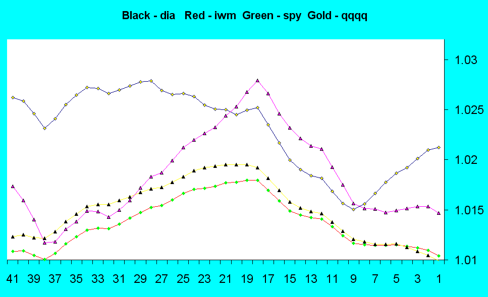
I've been expecting an overall decline in the market for some time now (who hasn't) and wouldn't be surprised to see it slide down through December then start getting active again in January. If the last seven days are a clue there is absolutely no volatility left in this old beast at all. The VIX is signalling that the market ahead should remain largely listless. The other day (Friday) was the first sign of life the VIX has shown in a while. Of course it could go right back to sleep but I think it will start increasing here as a signal that some volatility will be coming back into the market come January.

We'll see.