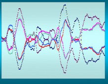
The difference between these two charts is that the USDJPY reflects the movement of the Yen in relation to the dollar and the FXY chart reflects the movement of the dollar in relation to the Yen. Consequently they are almost mirror images of one another. Why Rydex chose to do it that way is beyond me but they did and that's what we have to live with. Note that they are not perfect but they are pretty close.
Want to see another mirror image of the FXY? Here it is -

Wow – the Q’s mirror the FXY. How can that be? What part of “global” in ‘global economy’ don’t you suppose CNBC understands? Again, not perfect, but pretty close.

No comments:
Post a Comment